


The definition of color is a component of light that is separated when it is reflected off of an object. The appearance of things or light sources is reflected as the individual’s perception involving hue, lightness, and saturation for objects, and hue, brightness, and saturation for light sources. Boring right?
Color is perception. Our eyes see something (the sky, for example), and data sent from our eyes to our brains tells us it’s a specific color (blue). Objects reflect light in different combinations of wavelengths. Our brains pick up on those wavelength combinations and translate them into the phenomenon we call color.
But have you ever wondered, most of the time, a restaurant brand logo is Red or Orange? For example, food chains like McDonald’s, KFC, Burger King uses Red or Orange in their brand logo.
Color theory is both the science and art of using color. It explains how humans perceive color; and the visual effects of how colors to mix, match or contrast with each other. The color theory also involves the colors of the message communicated and the methods used to replicate color.
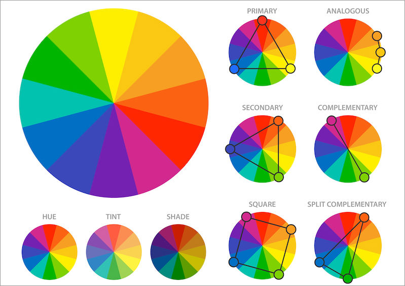
By systematically categorizing colors, we can define three groups:
- Primary (red, blue, yellow)
- Secondary (mixes of primary colors)
- Tertiary (or intermediate – mixes of primary and secondary colors)
Color works in cohesion with iconography, typography, and an overall optimized UX to achieve optimal results. Colors improve the visual appearance of your app and improve its UX by aiding in navigation. The state of mind induced by the different colors affects how users interact with your product. This color could translate to whether or not they convert into paying customers. As such, they understand the psychology of color. To leverage it to best suit the purpose of your mobile application is fundamental.
The modern person uses a myriad of tech/non-tech products every day. Here’s how some of your popular products are applying the principles of color psychology.
You may also have noticed that e-commerce sites (Amazon, Alibaba, Jumia), retailers, and various consumer brands tend to go with the warmer colors. This is because the colors on this end of the spectrum evoke feelings of happiness and energy and subconsciously make the user more likely to make a purchase.
Numerous social media platforms also go with warmer colors that set a bright and cheerful mood on their platform. Think Snapchat’s yellow and Instagram’s vibrant mix of pink and yellow (evident in the logo).
Financial service firms like banks (think Barclays/ ABSA’s former branding, VISA ) and tech companies (think Twitter, LinkedIn, Facebook) go with the more stunning colors. Blue is especially popular with this category of brands, as they seek to evoke the feeling of calm and trust in their user base.
Like what color your logo should be. The emotions that colors evoke in a consumer and the psychology behind color choices on your website or Mobile Applications. With this basic knowledge about the colors and color schemes for branding, marketing, and sales, you’re prepared to make effective branding decisions.
With this in mind, how about taking another look at your app before publishing it on the store for your users to get a hold of.