


Typography is the craft of endowing human language with a durable visual form.” ― Robert Bringhurst. A well-said quote that can justify Typography in my point of view. Whether from your phone, website, printing books, or leaflets, we constantly digest words daily. We often reflect on the power of the written word, but rarely do we consider the designer’s role in emulating the tone of the word or sentence.
But, can someone imagine a person behind constantly trying to build a relation between the design of the text and what it is trying to say? Yes, this someone – The mighty designer, the artist of design day-to-day life constantly working on it to give it a shape. A shape of arts, design, and text.
So the main question remaining is what is Typography, and do we need to think about it or not?
Imagine you are typing a leave of absence application to your boss. But for some ungodly reason, you are using comic-sans font. In another way, in the same application, you use bold type words or italic words. How the receiver will feel and how he will judge you. More straightforwardly, it can say that typography matters; it matters a lot.
Typography can be an intimidating subject, but it doesn’t have to be. You only need to know a little to make a big difference in the stuff you do every day. So let’s get started—first, some common types of fonts and what you need to know about them.
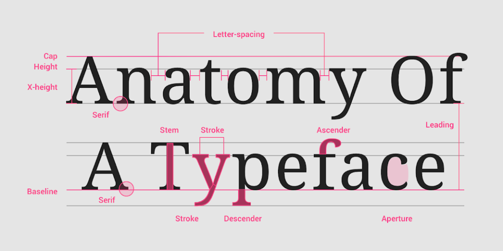
Serif
A serif is a small shape or projection that appears at the beginning or end of a stroke on a letter. Typefaces with serifs are called serif typefaces. Serif fonts are classified as one of the following:
Old-Style serifs resemble writing in ink, with:
- Low contrast between thick and thin strokes
- Diagonal stress in the strokes
- Slanted serifs on lower-case ascenders
Transitional serifs have:
- High contrast between thick and thin strokes
- Medium-High x-height
- Vertical stress in the strokes
- Bracketed serifs
Didone or neoclassical serifs have:
- Very high contrast between thick and thin strokes
- Vertical stress in the strokes
- “Ball” terminal strokes.
Slab serifs have:
- Heavy serifs with imperceptible differences between the stroke weight
- Minimal or no bracketing
Sans Serif
A typeface without serifs is called a sans serif typeface, from the French word “sans” that means “without.” Sans serifs can be classified as one of the following:
- Grotesque: Low contrast between thick and thin strokes, vertical or no observable stress
- Humanist: Medium contrast between thick and thin strokes, slanted stress
- Geometric: Low contrast between thick and thin strokes, with vertical stress and circular round forms
Monospace
Monospace typefaces display all characters with the same width.
Handwriting
Handwriting typefaces are unconventional with a natural, handwritten feel. These typically are used as H1 – H6 in your type scale. They come in the following forms:
- Black letter: High contrast, narrow, with straight lines and angular curves
- Script: Replication of calligraphic styles of writing (more formal)
- Handwriting: Replication of handwriting (less formal)
Other than font, there are also some points worth mentioning –
- Readability – While legibility is determined by the characters in a typeface, readability refers to how easy it is to read words or blocks of text, which is affected by the style of a typeface
- Letter-spacing – Letter-spacing, also called tracking, refers to the uniform adjustment of the space between letters in a piece of text.
- Line length – Line lengths for body text are usually between 40 to 60 characters. In areas with wider line lengths, such as desktop, longer lines that contain up to 120 characters will need an increased line-height from 20sp to 24sp.
- Line height – Line height, also known as leading, controls the amount of space between baselines in a block of text. A text’s line-height is proportional to its type size.
- Paragraph spacing – Keep paragraph spacing in the range between .75x and 1.25x of the type size.
- Type alignment – Type alignment controls how the text aligns in the space it appears. There are three type alignments:
- Left-aligned: when text is aligned to the left margin
- Right-aligned: when text is aligned to the right margin
- Centered: when text is aligned to the center of the area, it is set in
Typography is such a vast area of the field that here I tried to give a glimpse of this subject. Hope, I will try to explain a little bit more about this matter. Any kind of comment is appreciable.